#Not-For-Profit #ContentStrategy #Search
Content and search strategy for a historical society’s website
The client.
The BC Labour Heritage Centre (BCLHC) preserves and shares the history of workers and labour movements in British Columbia. Its website houses a rich collection of over 400 resources, including historical artefacts, booklets, videos, podcasts and plaques.
The challenge.
BCLHC had an extensive and valuable collection of resources, but the website made it difficult to find and use them.
Content was spread across a confusing and inconsistent structure, with many resources buried within pages rather than accessible on their own. The search function returned irrelevant results, navigation was circular and inconsistent, and users often hit dead ends. Broken links, uneven content, and accessibility issues further affected usability.
As a result, key audiences — including researchers, teachers, union members and the general public — struggled to find and engage with the centre’s content.
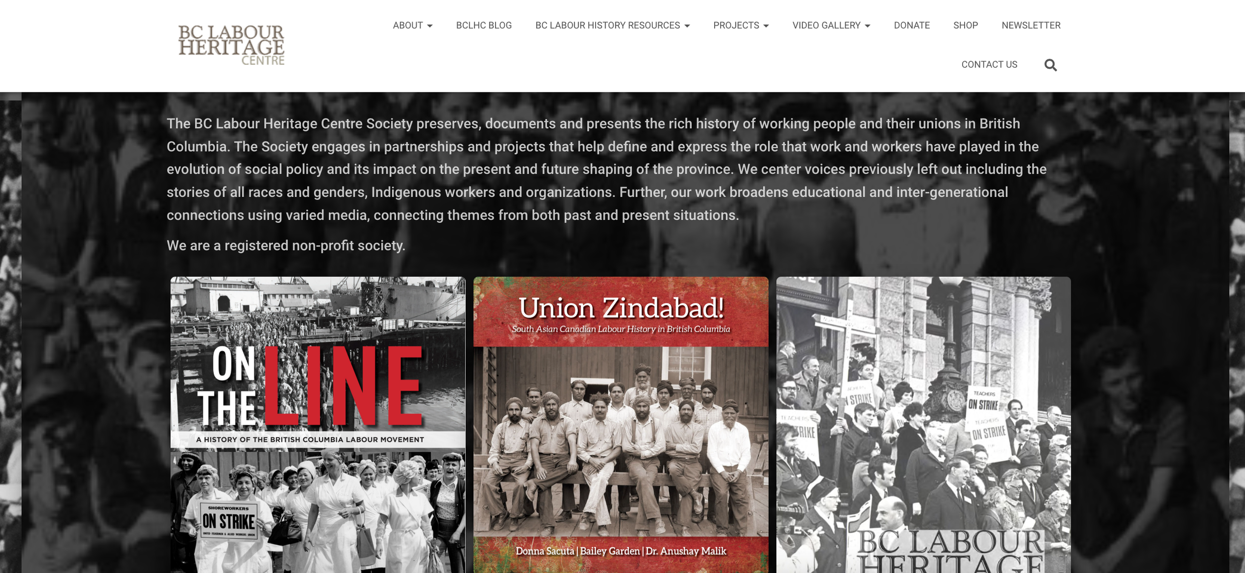
Before.
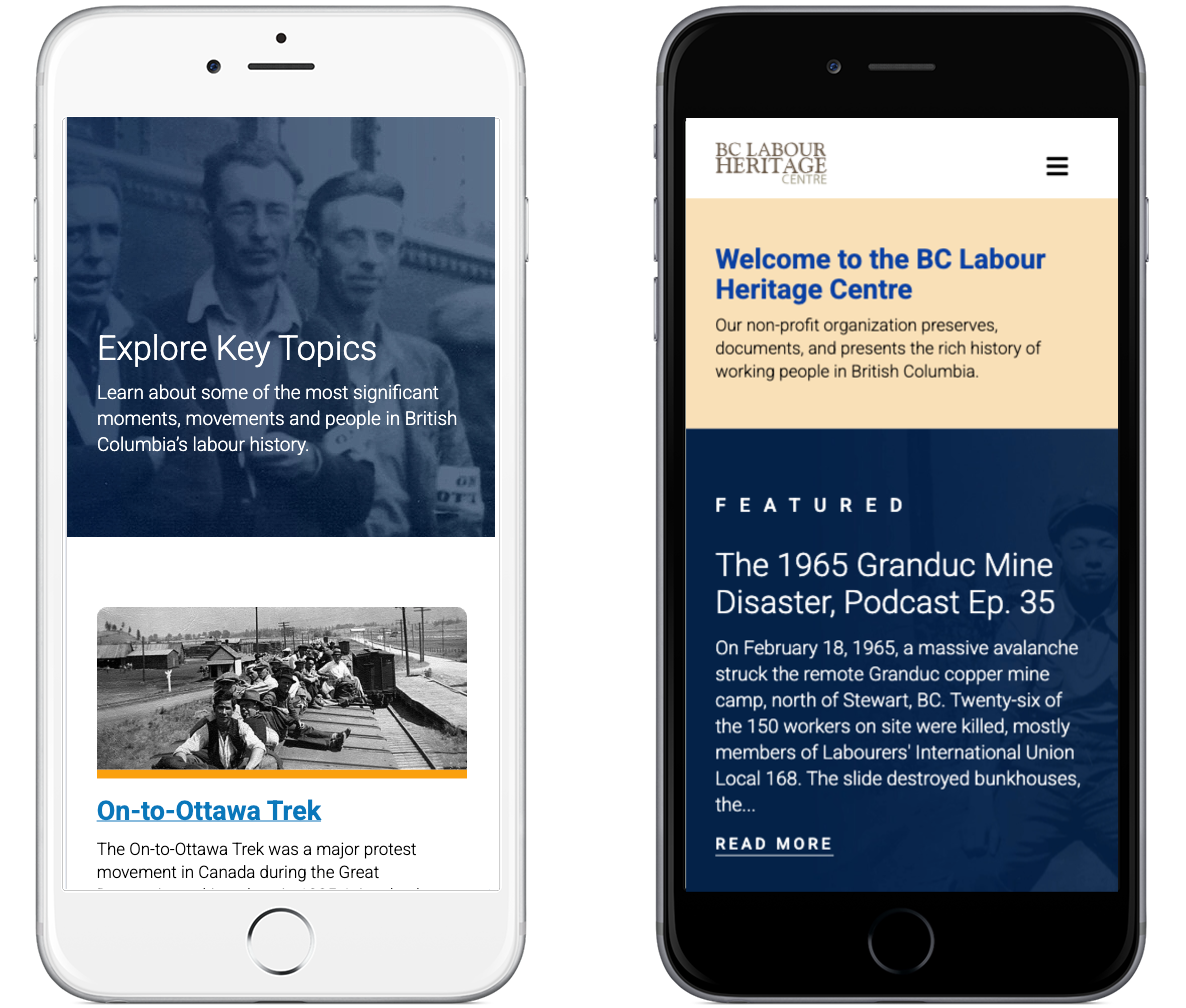
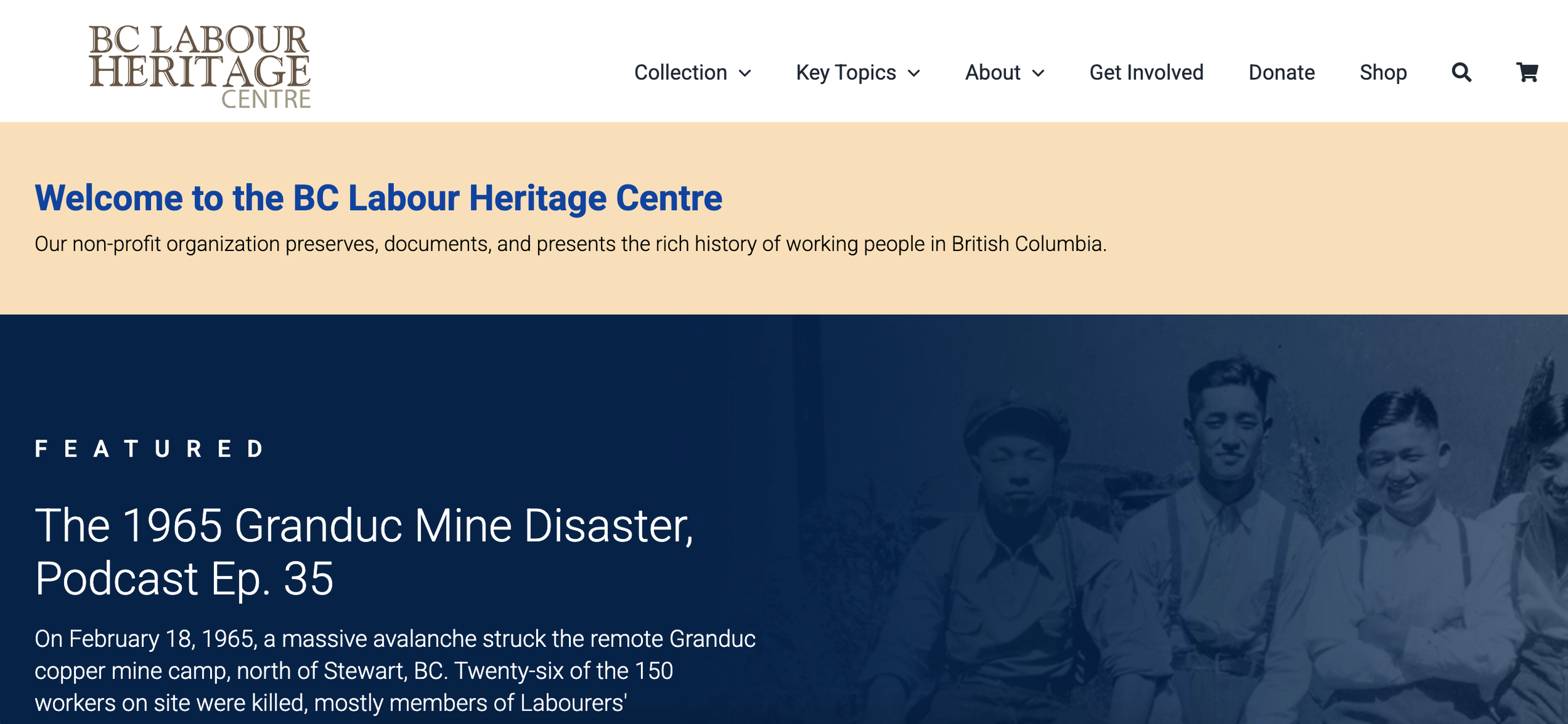
After.
My work.
I led content and search strategy and UX writing as part of a small creative team, working closely with a developer and designer.
1. Research and audit
I started by interviewing key stakeholders to understand their goals, how they used the site, and the needs of their audiences.
I then carried out a comprehensive content audit, cataloguing over 400 resources and pages. I recorded content hierarchy, quality, accessibility issues, analytics, relevance and usability.
This surfaced widespread issues, but also highlighted the scale of the opportunity — a valuable collection of resources that was largely hidden from users.
3. User pathways
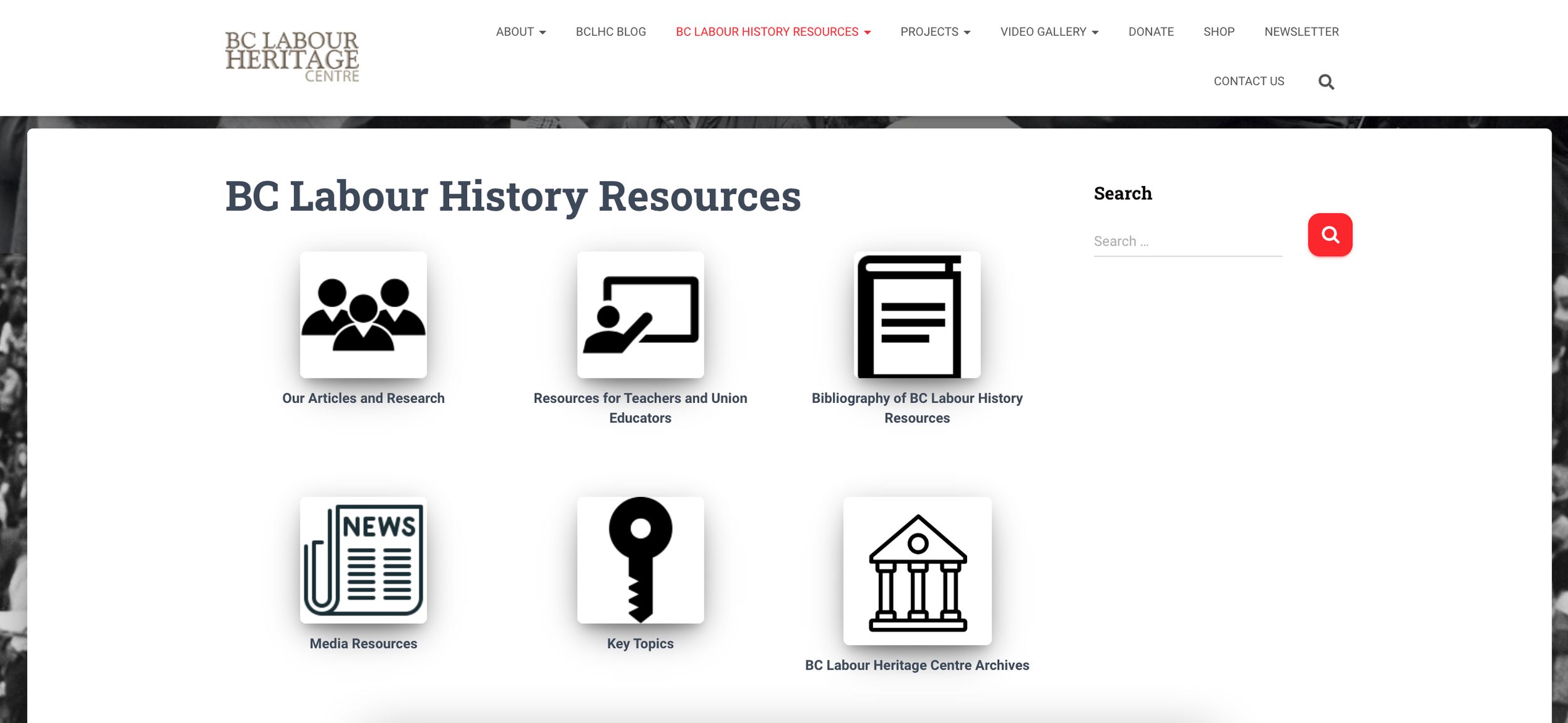
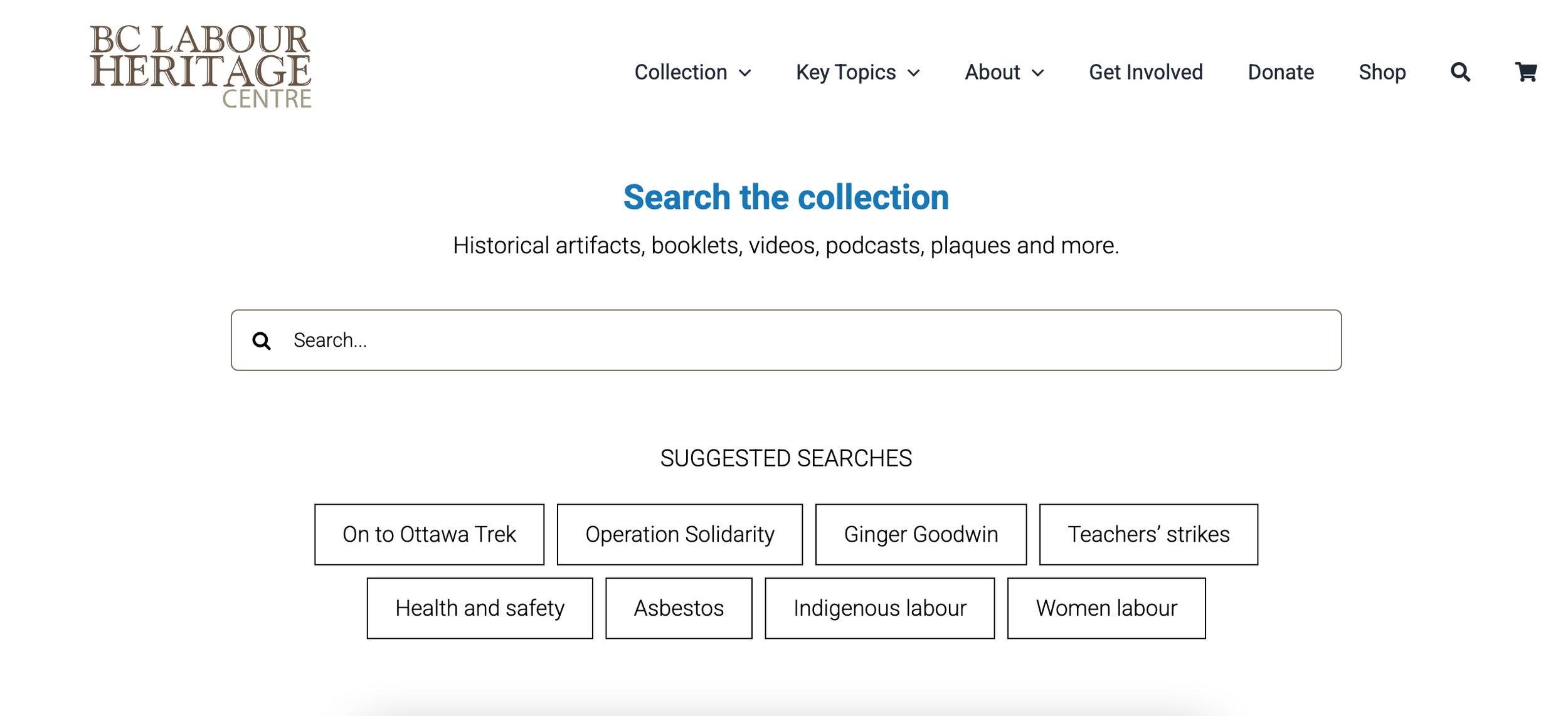
I introduced multiple entry points into the content, including a prominent search experience with suggested searches, a dedicated search page with detailed filters, and curated collections.
To improve engagement and reduce drop-off, I worked with the developer to introduce components such as auto-suggested content, ensuring that resource pages were not dead ends.
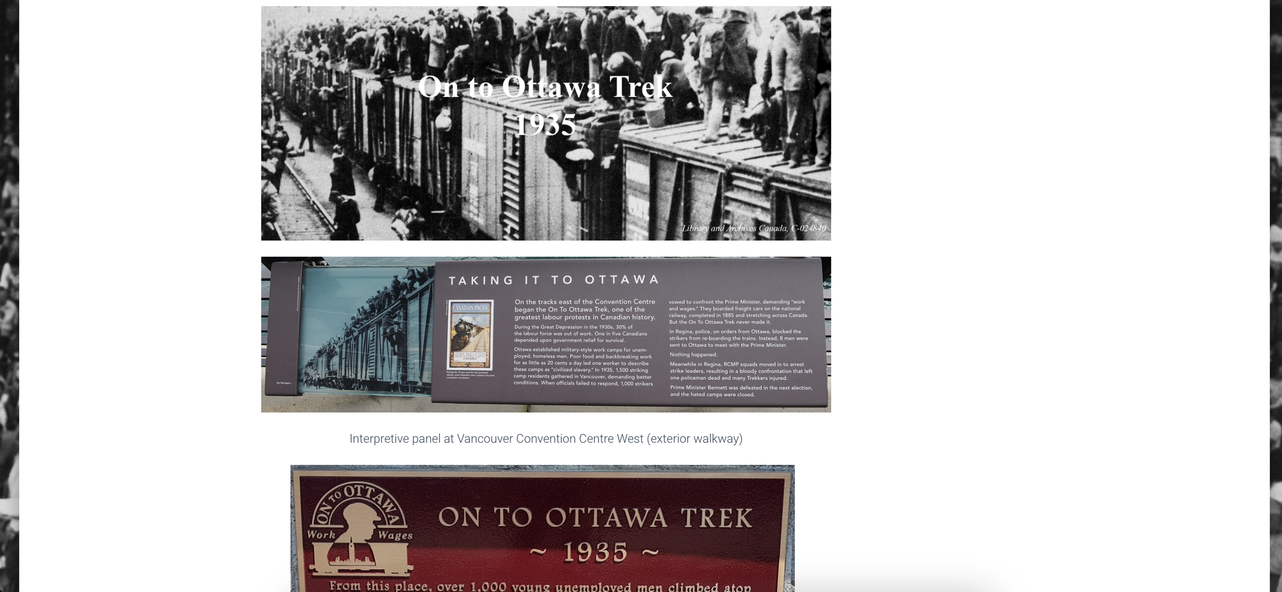
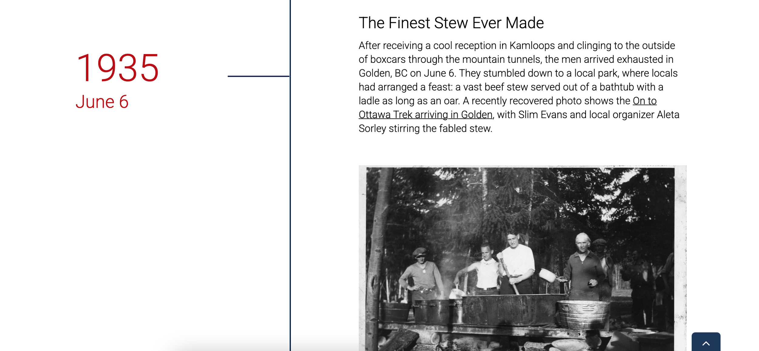
I also identified the need to cater to users who had a general interest in labour history but nothing specific to search for. I recommended creating a key topics section to guide exploration. These pages deliver effective storytelling with curated media and a scroll-based timeline that encourages deeper engagement.
2. Site restructuring
Based on insights gained from the audit, I proposed a complete restructuring of the site. The core idea was to make every individual resource accessible, searchable, and linkable in its own right — a significant shift from the existing model.
The new structure would allow users to find exactly what they needed, and enable the centre to link directly to specific resources in their newsletters and on social media. The client quickly got behind this approach and was keen to move forward with it.
My next step was designing an information architecture and search strategy. This included defining content types, categories and tags, shaping how resources would be added, and mapping clear user pathways.
4. Wireframes and content
I developed wireframes for all pages on the website, collaborating closely with the developer and designer to ensure successful implementation. I wrote key interface copy to support clear, intuitive navigation.
The client was responsible for writing content for the individual resource pages, so I provided detailed guidance on tagging, SEO copy, descriptive headings and content structure. I supported them by answering specific questions as they developed the content.
Content accessibility was a key focus throughout. I ensured meaningful alt text for images — particularly photos of historical plaques containing important written content. I also recommended improvements that the centre is implementing over time, such as adding transcripts and captions for all video content.
The result.
The redesigned site has transformed how users interact with BCLHC’s content.
Search is now fast, accurate and highly effective, allowing users to find even niche resources with ease. Clear pathways support different audiences and user needs — whether they’re searching for specific materials, exploring curated collections, or learning about key historical moments in the labour movement.
The result is a modern, user-centred platform that does justice to the centre’s collection, empowering people to discover, use and share its resources.